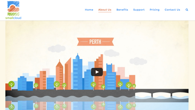
Green fields sites let you completely synchronise all your visual branding. In this case, we started with a logo, developed an animation that used the logo, then built a web site around the animation.
The site is designed to communicate the simplification that SmallCloud makes available, because technology solutions have the potential to intimidate. Hence the straight-talking language, the simple pastel pallet and the uncomplicated layout.
Every time you introduce a different visual element, you tax the brain. That’s why you keep your visual branding consistent. Familiar visuals reinforce the pathway in the brain you created the last time. If you get it right, you remove every distraction from the message. And if you really get it right, you reinforce the message every time your logo or colour scheme appears.
Thanks to client Garry Bloom for trusting and designer Dan Newson for skillful and efficient execution.