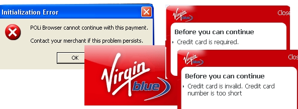
Wasted over two hours booking accomodation online through Virgin Blue. A slew of bugs (see above) that rejected my card, then didn’t, then did and an alternative payment system that did not work.
It’s not just the bugs; the User Interface is dreadful. To book non-return travel requires you to enter data in about 30 fields and pay for each leg separately. If everything goes smoothly, that means a Sydney-Canberra-Perth trip requires 90 fields to be filled in. In my case, because things were not working, close to 500 ticks, numbers and words. For Pete’s sake.
In the end, I abandoned the airline’s site and booked elsewhere. Cost me a few extra bucks.
For consumer sales, the airline industry has almost completely migrated to the web. I love electronic ticketing; that’s a great improvement but the web interface is like a big pontoon. They just launch it and sit on it. Reality is, it needs up-keep and innovation.
Why do they only offer ONE interface? Maybe they could have an API and invite web companies/travel agencies to build interesting front ends.
Why don’t they auction empty seats? And what about this:
Mr Treasure; here are your accommodation, hire car & restaurant vouchers in Sydney and Canberra. For $20 you can be part of Virgin Public, where others on the plane can access your profile details and message you in flight.
Me: No, forget it; just fix up the bugs.
Mr Treasure: Did you know that for only an extra $30, we can arrange for your check-in attendant to be unable to find any of your information? Simply provide us alternate spellings of your last name and it’ll be like you were never there! Imagine… almost complete anonymity with the click of a button!