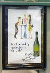
As is my wont, here are some more bad examples of outdoor advertising. These are bus shelter ads. It’s an unusual medium because some people will read them close up but the focus is really drive-by traffic.


Why so small? It’s my attempt to simulate the effect of driving by at 92kph. Yes, I just got another speeding fine. The ads are for Killawarra wine and Vodafone and really, they should have given their advertising budget to the earthquake victims. Text so small and weedy as to be completely unreadable.
Here’s a better one:

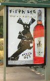
I’m not sure the Fifth Leg cartoon character is all that engaging and I’m not sure it enhances their image as a premium wine but FUNGULO, at least you know who the advertiser is and what they’re selling!