![]() That was what the designer came back with. Essentially, this was the brief:
That was what the designer came back with. Essentially, this was the brief:
Questo
Logo and badge/seal/banner for Italian food line
‘Questo’ is the Italian word for ‘this’. It’s planned to use the logo in conjunction with a by-line for each of the product lines, e.g. Questo è lasagne.
We’re looking for a concept that translates that logo into packaging art, i.e. a concept for a badge/seal/banner.
Style
We’re trying to evoke ‘filling and wholesome’. The glyphs should be well-fed!
Colourways
Food and photography visible on the packaging will generally be orange (breadcrumbs), pasta or bolognese sauce coloured and we need the logo to work with these colours.
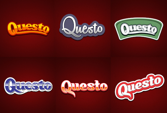
So how’d you go? Of the six options, bottom right is the correct answer. Legibility is a critical factor in logos and that one wins hands-down. The middle one on the top line was also legible but didn’t send the signal ‘filling food’.
We then moved on to the badge/seal/banner stage.
I asked to see some colour alternatives as the red and white was a bit ‘budget’. This was my mistake, not the designer’s because I didn’t specify ‘premium’ in the brief. I uploaded two product shots that will appear on the packaging to a site that creates colour palettes from photographs and sent the output (some dark greens, dark browns and burgundies) to the designer.
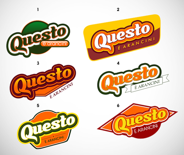
I asked him to mock up “Questo è arancini”, where ‘è arancini’ is on a separate line and here’s how he responded:

![]() I’d caused confusion by saying the client wanted orange as one option and the designer, whose first language is not English, made orange the central theme in all of them. So I apologised and asked to see some of the sombre colour options more aligned with a premium product.
I’d caused confusion by saying the client wanted orange as one option and the designer, whose first language is not English, made orange the central theme in all of them. So I apologised and asked to see some of the sombre colour options more aligned with a premium product.
Looking at the various ‘badge’ options, I chose #2 and #4. I requested we make “È ARANCINI” lower case; I wanted to make the foreign words a bit less challenging to read.
With #4 I thought the ribbon looked stiff and artificial. I asked for it to be made more fabric-like in its form. And here’s the conclusion in the winning colour:

![]() The central one would make a GREAT logo for a line of meat pies. It suggests the curve of a pie crust, the words are highly legible and the colour combination really pops. But the right hand version is the winner. Wholesome, filling and definitely premium.
The central one would make a GREAT logo for a line of meat pies. It suggests the curve of a pie crust, the words are highly legible and the colour combination really pops. But the right hand version is the winner. Wholesome, filling and definitely premium.
Arrivederci. Dinner time.