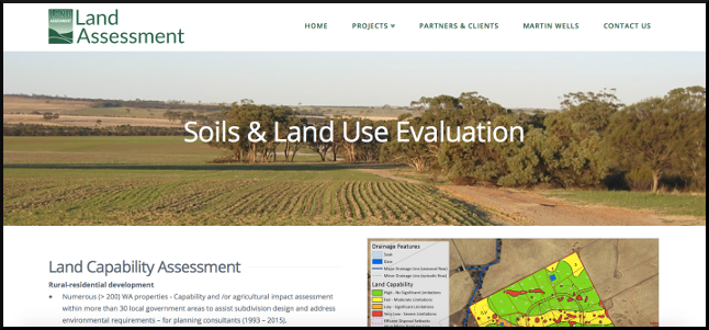
I like that layout, the client said. Can we use it on those other pages? I think it’d work better than what we’ve got. Those links are not prominent enough. Can we put them in bold? There’s really too much content on the home page when you’re looking at it on a phone.
In all of the above, the client’s instincts were good. He’s not a web designer, not even strong on aesthetics, but he knew what he wanted and when he screwed up his face it generally meant he was right. His active contributions got him a better web site than if he’d left it entirely to me. And there were elements that the designer and I wanted that were better than the client’s ideas. Well you’d hope so. The client was gracious enough to take advice on most of those.
It’s the jobs where you constructively collaborate that deliver the most satisfaction. It means knowing when the client is right, and being equipped to persuade/assert when the client is wrong. Each party needs to be prepared to give ground and the rules of engagement need to be well understood. Advanced communication skills are a necessary ingredient in terrific web sites; in this case, a beautifully responsive and uncluttered site for agriculture and environment consultancy, Land Assessment.
Happy client, happy supplier. Worked with designer Dan Newson; he was great.
